TYPOGRAPHIC POTENTIAL OF VARIABLE FONTS
This article is based on the presentation What The Government Doesn’t Want You to Know About Variable Fonts delivered at ISType conference in Istanbul in June 2017. It’s a summary of my personal thoughts on recent developments that might have an effect on responsive typography. It is also a collection of references to inspiring projects and experiments some of my colleagues have been doing. It touches on a few concepts I found necessary to explain but it shouldn’t be considered an in-depth report on those.
This text uses one of my fonts for headlines and the body text is set in James Edmonson’s Vulf Mono in different styles. Neither of these are system fonts, so in order to show this text in the way I want you to see it those fonts had to be loaded on the device you are currently reading this text on.
Downloading any file from the internet takes a bit of time. Font files are generally small, so it should only take a few seconds on a decent network. Until they are downloaded and ready to be displayed, browsers can hide the text (Flash of Invisible Text) or show the text in a fallback font that already exists on your reader’s device (Flash of Unstyled Text). Nobody likes staring at an empty page or have the text swap fonts while they are reading. If a webfont takes very long to load, there are some workarounds to both of these options to make the reading experience as pleasant as possible. Once the fonts are loaded, the page will be rendered again using the webfonts we want you to see.
Optimizing webfont loading is a big concern especially for international companies that might have texts in different languages and writing systems on their website. To keep people engaged, websites have to load fast. According to Google Analytics data over half of all mobile site visits are abandoned if the page doesn’t load within 3 seconds.
This is why companies like Microsoft, Apple, Google and Adobe are motivated to find a way to improve loading time. In September 2016 they announced a revision of the OpenType font format specification. The big news is that the spec now allows for OpenType Font Variation, also known as variable fonts. If you haven’t heard about variable fonts yet, the most exciting bit in one sentence: One OpenType variable font file can contain the equivalent of multiple individual fonts. But unlike for example a .zip file, which is a container format, a variable font redefines how information is stored in the font file.
Going back to the fonts on this website: Chances are the weights I’m using have common design characteristics. Glyph outlines define themselves through coordinates which are stored in the font file. Up until the introduction of font variation, those sets of related outline data had to be stored in individual font files. If used as a webfont on your website they’d all have to be loaded separately. Variable fonts on the other hand allow you to draw parallels between these coordinates. You can store only one set of coordinates for each glyph in your font file and add instructions, so-called deltas, to the font on where to move those if you select a different weight.
As a result you gain access to not only a few weights but have fine-graded control because instructions on how to interpolate between the coordinates of the pilot font and the rest of your design space is already available.
My example is deliberately simplistic. There are several other tables that will have to contain crucial information to make a variable font work. You’ll likely start seeing performance benefits on your website if you are using three or more instances of a simple variable font. The extent of the performance gains becomes more difficult to anticipate the more complex your design space is. The example used in the announcement of the OT spec update mentioned that five static fonts of a subsetted version of Segoe UI family add up to 657 kB (525 kB if packaged as a TTC) while a variable font covering the same design space would be only have a file size of 199 kB. That’s about 70% reduction in file size!
If you were a web developer for, say, the New York Times you’d probably be very excited about variable fonts. Looking at a regular article on their site showed that they are using three different typeface families. Five upright styles of New York Times Cheltenham and three styles of New York Times Franklin have to be loaded in order to display the whole page. If you replaced these nine static fonts with two variable fonts, load times could be immensely improved.

A design space can have a multiple axes. The New York Times uses a condensed version of NYT Cheltenham in numbered lists so you’d want both a weight and a width axis. Beyond the common registered axes, you can add custom axes to your design space, resulting in a near infinite number of font instances to choose from. Variable Fonts also have all sorts of capabilities for additional masters or even glyph-specific tweaks to the design space. The design possibilities of variable fonts are greatly exciting but the specifics of font variation technology is not going to be the focus of this post.
Instead I’d like to give two examples of design variation that have historically been important but didn’t quite have a breakthrough in digital fonts.
To differentiate semantic elements within a text and to achieve hierarchy and introduce clarity to the information in written text we need different styles and weights of a typeface family. John Morgan described the thinking behind the typographic decisions made for the Common Worship book in detail in Typography Papers 5. About the choice of the typeface he says that he and Derek Birdsall were looking for a type family that contains styles that are clearly distinct from each other while staying obviously related.
As a reminder: A type family is a group of typefaces that are connected to each other, usually through common design characteristics. The most common parameters that link typefaces within a family are weight and width. Some families also have a significantly different construction but work well in combination, like formal and informal styles. There are also serif designs that have a sans counterpart. These two will have stylistic differences but perhaps share similar proportions and achieve a similar colour on the page.
Before those secondary styles that complement a Regular Roman typeface were introduced, a set of fonts designed for different point sizes was usually referred to as a typeface family. In metal type these size-specific designs were meant to compensate for a number of factors that could affect the printing, like quality of paper, amount of ink, pressure, and degradation of the metal letters over time. The smaller the type size the bigger the impact these factors had on the legibility of the text. To counteract this the shapes had to be slightly altered to make the characters of the small sizes as readable as possible. There are two different approaches to compensate for varying printing conditions but they both share the common aim: optimised legibility at small sizes, and optimised personality at large sizes.
Grades for different point sizes differ in weight and contrast. The letters will occupy the same horizontal space to avoid reflow of text.

Shapes for small Optical Sizes on the other hand are often wider and the spacing is increased. The letterforms usually have a larger x-height in relation to the capitals and shorter ascenders and descenders. The stroke contrast is lower and details are less delicate to remain visible in small sizes. The opposite is true for display sizes which have commonly narrower features, a tighter spacing and more elaborate details.
With the introduction of the pantograph and later phototype and digital typefaces we saw fewer families with adjustments specific to each size. As a compromise font families with designs for different purposes have been introduced to still allow for some typographic quality.

These purpose-specific fonts will have to cover a range of point sizes. They will be mathematically scaled if used at a different size than the exact target size it was designed for. Not quite a “one-size-fits-all” approach but a compromise in comparison to true optical sizes anyway.
But, is this level of typographic finesse still needed for reading on screens?
While we don’t have to worry about printing conditions anymore, reading on screens brings a whole different set of variables, the most obvious being that we can’t predict how our text will be read. We don’t know which browser is going to be used on which device and what resolution.
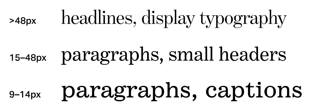
Text on low-resolution screens will appear differently than on high-resolution devices. And the smaller the type size, the fewer details will be visible to a point where at very low sizes we are only concerned with keeping the text legible. Reading text in small sizes will remain difficult whether it is on paper, low or high resolution screens. So you need to inject some extra legibility in letterforms to compensate.
Typefaces with optical compensation, like Benton Modern and the latest version of Matthew Carter’s Sitka, take this into account. Sitka is an interesting example because it has six purpose-specific designs: Small, Text, Subhead, Heading, Display, Banner.
To make best use of the updated version of Sitka Microsoft decided to add fields to the OS/2 table to allow fonts with multiple optical styles to specify the size range for which they were designed. This meant that applications which read these new fields can automatically select the correct optical size font for the font size the user selected.
Sitka was shipped about four years ago and as far as I know this mechanism hasn’t been very popular for different reasons. The project would probably be approached differently today. Adjusting a design for different purposes is no longer necessary. Instead you would add an optical size axis to your variable font and be able to have true size-specific optical compensation and regain the full typographic control we were lacking since metal type.
Marianna Paszkowska recently gave a talk at TYPO Labs conference in Berlin and, while her presentation focused more on the interactive and entertaining opportunities of variable fonts, she also mentioned over-choice. Choice overload is a cognitive process in which people have a difficult time making a decision when faced with many options. Marianna concludes that variable fonts with a complex and wide design space might confuse users more than it helps them and that the choice should not be given to the user.
Rob McKaughan, a typographer in the Advanced Reading Technologies team at Microsoft, says: ‘It’s like giving people a toolbox filled with all kinds of really amazing tools, then telling them to go build their own house. For professional construction workers and the DIY crowd, this is great. Not so good for others, though.’
I agree that it’s important to make a distinction between different kinds of users. Variable fonts will sooner or later make their way into all sorts of applications. I used the web as an example but we’ll find them as system fonts and desktop fonts to be used in Microsoft Office applications or Adobe’s Creative Suite and on all kinds of e-readers. There is no stereotype for a potential user and end-user of variable fonts.
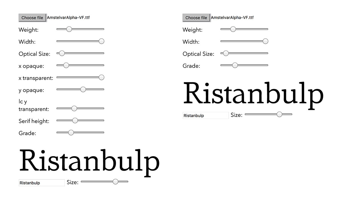
Luckily this is being considered. In order to avoid exposing an overwhelming design space to the user, there will be a differentiation between axes that are visible to the user and some that are working in the background. As an example, David Berlow, who designed the variable font AmstelVar, might choose to expose only a few of the nine axes of the font in user interfaces. Others might be intended for programmatic interactions.
These algorithms that are going to select the best possible axis settings for the reader is where I see the biggest typographic potential of variable fonts.
Unlike in print typography, for reading on screen the physical size of a letter shouldn’t be the sole criteria for its level of optical compensation. Factors like pixel density, screen orientation or viewing distance should play a role too. Marko Dugonjić experimented with responsive typography long before variable fonts were introduced. In his demo he uses face recognition software to detect the distance between a reader and the device and adjusts the type size accordingly.
While the idea is interesting and the adjustments done to the typography could be taken to the next level using a variable font with a grade axis, the actual reading experience is somewhat uncomfortable if the text reflows and letterforms are constantly changing shape as the reader moves around.
Andrew Johnson and Erik van Blokland also did some tests with interpolated type based on a reader’s distance to the text. They focused on a scenario likely to happen in augmented, virtual or mixed realities. The idea behind this example is that parts of a signage’s text will be enlarged based on a person’s proximity to it.
Another factor likely to affect the reading experience is the light situation in the reader’s environment. Tom Lokhorst posted this video on Twitter in the beginning of this year. He’s covering the ambient light sensor next to the webcam of his laptop, simulating a dark environment. As a result the screen brightness and with it the font’s grade changes.
Changing font grade (weight irrespective of width) based on ambient light. “Heavy” font in low-light. #typography @q42 pic.twitter.com/hAN8f2vNnB
— Tom Lokhorst (@tomlokhorst) March 1, 2017
As typographers and designers of text typefaces we are concerned about improving the reading experience. But how a text is being read will vary from person to person. For example, readers with lower and reduced acuity, including older readers, will have different preferences than a teenager with perfect vision.
We can predict some contexts. Pixel density and screen orientation can be known. We can relatively reliably predict viewing distance and light situation. But can we also account for personal preferences? Can software perhaps learn from the settings a user chose in the past? I do think that there is a place for recommendations for typography that should allow for relatively comfortable reading for a majority of readers. But can variable fonts improve the context awareness of responsive typography?
As soon as variable fonts are more widely implemented we will see that they can have an impact on our reading experiences that goes beyond faster web loading. I hope this article managed to give an overview of a small selection of opportunities we have at hand to change the way we read on screen. And I’m hopeful that we are one step closer to typography that is not only responsive to how and where the text is read but also to who is reading it.