GERMAN LANGUAGE
April 27, 2016
The lack of aesthetic compatibility between Latin uppercase and lowercase letters has long been a topic for discussion among type designers. The mismatch is particularly apparent in written German in which the first letter of all nouns is capitalised (see intro for more background). In the 1920s and 1930s, experimental proposals to harmonise German were put forward. Attempts ranged from reformations of spelling and grammar, to designs for universal alphabets which tried to connect the various languages of the Latin writing system. This is a very brief introduction to some of those ideas.
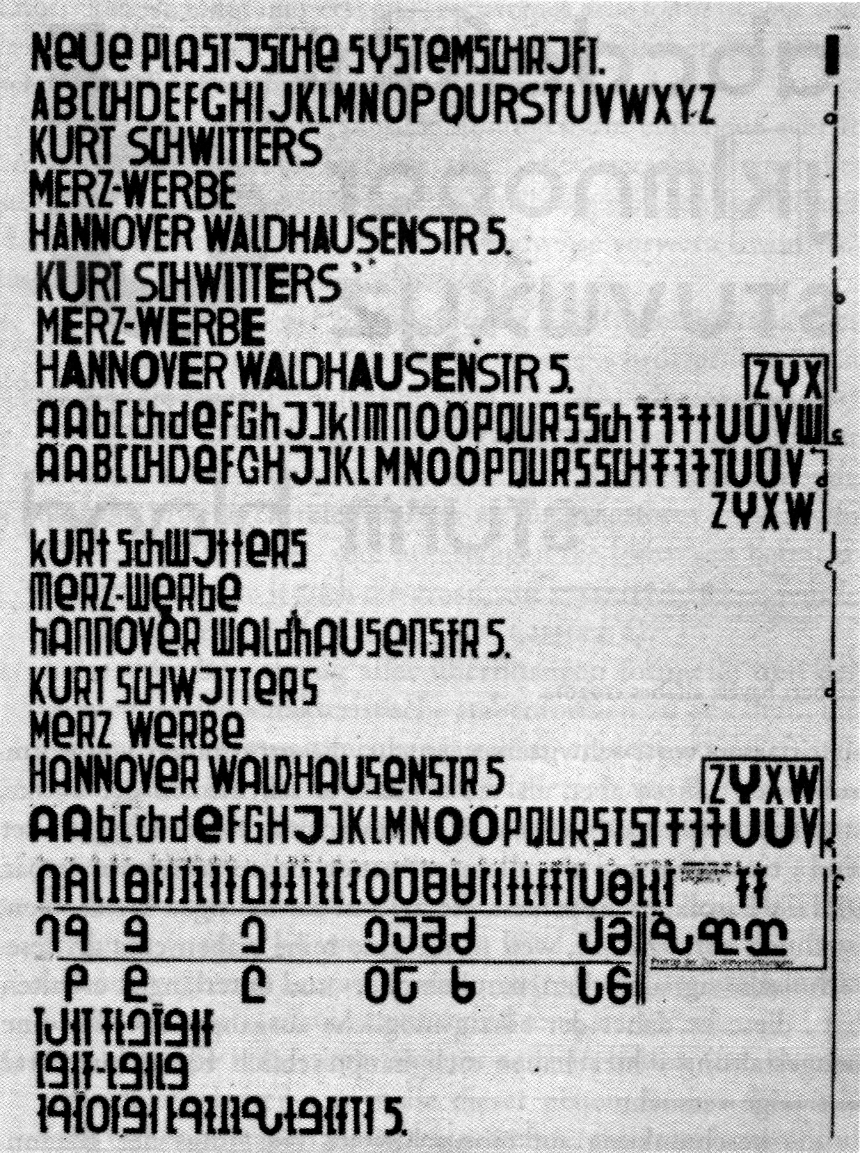
In his book Sprache und Schrift [1] Walter Porstmann described the disconnection between spoken and written German as a technological rather than an artistic problem. He suggested that the introduction of one character for every sound would simplify and speed up the education in reading and writing, and subsequently make room for more important topics like science.
His proposal for letters which mirror phonetic information introduced completely new shapes. They were ordered by tone, length, strength and voice.

He believed that even a world language based on sounds could be achieved. All that would be needed were world sounds, world letters, a world alphabet, a world type case, and world stenography.

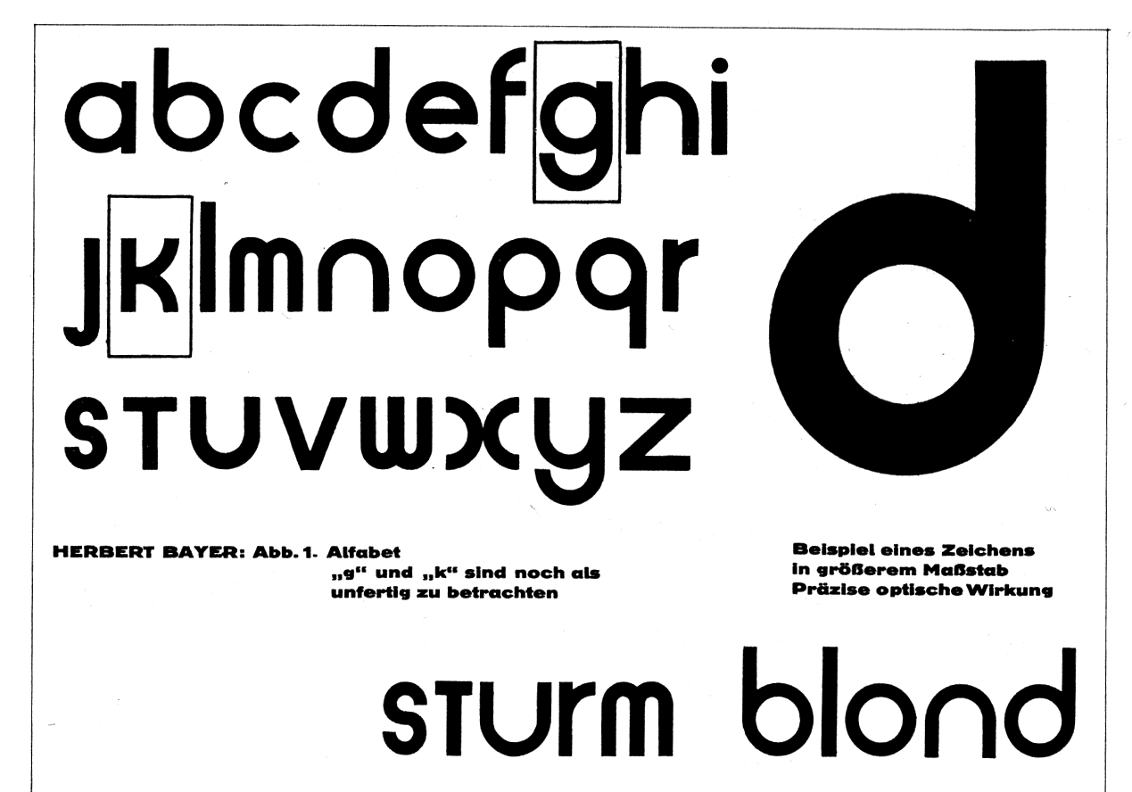
German modernists, like Jan Tschichold and Herbert Bayer, welcomed Porstmann’s ideas for their scientific basis. His attempts were considered as rational and gave a certain scientific context to their work. Tschichold was particularly fond of Porstmann’s ideas. In his opinion, all future developments of the German alphabet should be based on Porstmann’s proposal of a visual transformation of German sounds. In Tschichold’s opinion ‘a truly new writing cannot be thought without a better spelling’ [2]. Like Porstmann, he proposed the replacement of certain letter combinations with whole new characters, or suggested a different spelling to achieve a written language that reflects its phonetic sounds. For example, he argued the diphthong ɔʏ̯ as in the word Eule would be better represented by the letters oi than eu. In his proposal, he also introduced new phonetic marks which were meant to support the sounds of German.

Tschichold’s main idea for the refinement of the visual appearance of written German was the abandonment of capitals. He claimed the absence of capital letters would be an aesthetic and economic improvement and would enhance the readability. In his book Die neue Typographie [3], first published in 1928, Tschichold referred to a survey undertaken by him, with contributions from other professionals and supervised by the Bildungsverband der Deutschen Buchdrucker. It states that approximately 25% of the interviewees prefer to read German without capitals, 25% would like to keep the spelling and grammar as it is, and half of the interviewees favour a version which keeps capitals only in the beginning of sentences.
Tschichold believed the conflicting cultural origination and development of uppercase and lowercase letters contributed to an overall unpleasant appearance when used side by side [4], a statement some type designers of our time might agree with.
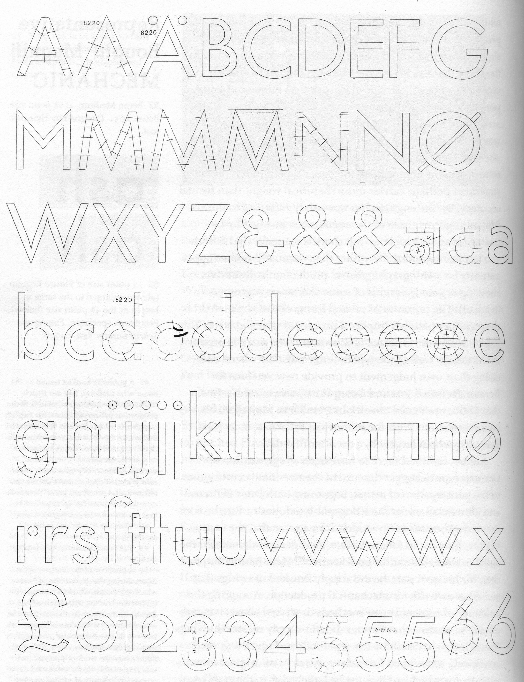
In his book Mechanisierte Grafik [5], Paul Renner argued that every font looks better if it is used to set English, French, or Italian, than German. Like Tschichold, he believed that current conventions in spelling and grammar contribute to the unpleasant appearance of the language. In his opinion, past orthography reforms only worsened this effect. Renner suggested limiting the use of capitals to the beginnings of sentences and names, as is common in many other languages. He also marked the many compound words of the language as harmful to its legibility. Renner’s proposal for a solution to some of these issues can be seen in his typeface Futura.
‘Although Renner was attempting to design a typeface with associations of universality, he nevertheless still considered the particular needs of the German language. For this reason, he described Futura as “an eminently German typeface”. When making his initial designs he deliberately gave the capital C and small c vertically-cut stroke endings, so that they could be closely spaced in relation to subsequent characters (compare the obliquely-cut upper stroke-ending of capital G). In German the letter after C is often H or K, and, if the C is wide, its internal space makes a gap in the word-shape. Another significant feature of Futura, uncommon in previous sanserif typefaces, was the difference in height between capitals and ascenders. […] He commented that this was already an advantage of some roman typefaces for setting languages other than German, but that it became even more important in typesetting the German language, with its great number of capitals.’ [6]
Otl Aicher’s opinion on the extensive use of capitals in German was of a more political nature. He ‘compared the introduction of starting nouns with capital letters with the change of society into feudalism, and subsequently into the modern administrative state. The victory of aristocracy over the towns and villages brought a central government, which abolished autonomy, self administration and individualism.’ [7]
This article is derived from my dissertation, Language-specific type design, written during my MA in Typeface Design at the University of Reading in 2011. As part of my research I collected examples of typefaces which suit some languages better than others. Some of the above ideas were admittedly borderline off topic but they formed one of the most captivating parts of my research. It would be worth having a closer look at some of those concepts to understand what exactly triggered them and how they were perceived at the time.
References
[1] Porstmann, W. (1920). Sprache und Schrift. Berlin: Verein Deutscher Ingenieure
[2] Guégan, V. (2010). Back to the Type Case. Livraison, no 13, Strasbourg: Rhinocéros
[3] Tschichold, J. (1987). Die neue Typographie. Ein Handbuch für zeitgemäss Schaffende. Second edition. Berlin: Brinkmann & Bose
[4] Tschichold, J. (1935). Typographische Gestaltung. Basel: Benno Schwabe & Co.
[5] Renner, P. (1930). Mechanisierte Grafik. Berlin: Reckendorf
[6] Burke, C. (1998). Paul Renner: the art of typography. London: Hyphen Press.
[7] Rathgeb, M. (2002). Otl Aicher: Design as a method of action. Unpublished PhD thesis, Department of Typography & Graphic Communication, University of Reading
Further Reading
Language as Design Criteria? Slavic languages