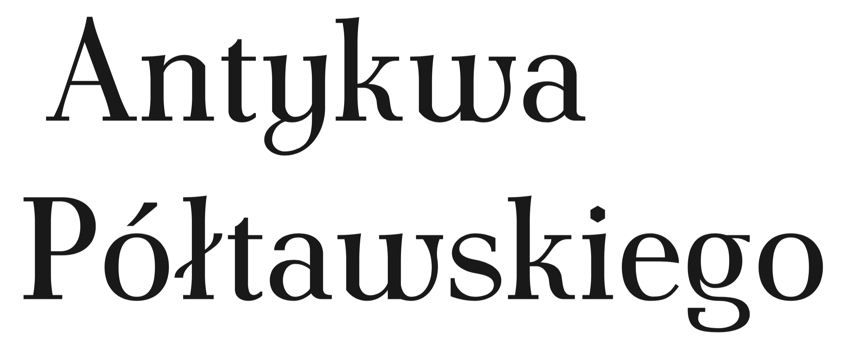
LANGUAGE AS DESIGN CRITERIA
April 20, 2016
A recent conversation on TypeDrawers about cultural preferences in typography threw me right back to 2011 and the months before I submitted my dissertation for the MA in Typeface Design at the University of Reading. Back then I attempted to find out if there are typefaces that suit some languages better than others and whether or not we can draw conclusions from their designs.
I was inspired by Ladislas Mandel who said that the designer ‘needs to analyse the characteristics of his supposed reader socially and culturally and choose shapes accordingly’ in order to achieve high legibility [1]. Richard Southall also touched on the topic in his article ‘A survey of type design techniques before 1978’ [2]. In his opinion, one makes different decisions on the fitting (spacing and kerning) of a typeface depending on the language the test document is set in.
I was left wondering if, for example, condensed typefaces are especially suited to typeset languages with a high frequency of long words. Or, if languages which make heavy use of diacritics require a lowered x-height. Should language be design criteria?

I started by looking at the features of official European languages which use the Latin script. Assuming that every peculiarity indicates a problem that should be tackled, I aimed to come up with recommendations for type designers to assist them in dealing with the wackiness of each language. I failed remarkably. The more I looked into the topic, the more I found myself embracing just those oddities. I had to admit that what seems slightly off to a non-native reader are more often than not features of cultural, social and historical importance.
As a by-product of my research, I produced profiles summarising the visual characteristics of the European languages that use the Latin writing system. I tried to identify those features by comparing the use and frequency of diacritics, the average word length, frequency of letters and letter pairs, and the use of capitals*. I will spare you my attempts to describe the visual appearance of each language in this post. In the vain hope that someone might find it useful, I made the data used for the analysis available here. One of the many conclusions which can be drawn from this kind of data is e.g. that French text, no matter in which font it is set, will always look different from German text simply because French uses different letters in a different order and frequency. French and German are, for example, on different extremes when one compares the frequency of capital letters. French also has a great many extremely short words such as à, si, se, la, et, au, un, de, le while the average word length of German words is comparably high. Those are features of a language that affect the appearance of written text.
*My analysis was based on corpora of 27 European languages. Few corpora can be found that cover two or more languages. Rather than gathering material from diverse institutions and risk differences in quantity, quality and in the nature of texts (informal/formal, spoken/written), I built relatively small-sized corpora specifically for the purpose of my dissertation. Each corpus consists of 200 words of legal text borrowed from the official United Nations’ translations of the Declaration of Human Rights in addition to excerpts from newspaper articles (1,000 words) on the raise of the US borrowing limit. The online editions from August 1st, 2011 of the following national newspapers of record were used: Adevarul (Romanian), Aftenposten (Norwegian), Akşam (Turkish), Aktuálně (Czech), Berlingske Tidende (Danish), Corriere della Sera (Italian), Dagblaðið Vísir (Icelandic), Dagens Nyheter (Swedish). Delo (Slovenian), Devni list (Bosnian), Diariovasco (Basque), Diena (Latvian), El País (Spanish), El Periódico (Catalan), Expresso (Portuguese), Frankfurter Allgemeine Zeitung (German), Gazeta Wyborcza (Polish), Helsingin Sanomat (Finnish), Irytas (Lithuanian), Le Monde (French), Magyar Nemzet (Hungarian), Nacional (Croatian), NRC Handelsblad (Dutch), Öhtuleht (Estonian), SME (Slovak), The Daily Telegraph (English), Vetem Lajme (Albanian).
As the main part of the corpora consists of newspaper articles on an international topic, foreign words and names appear occasionally. This affects the frequency of letters and letter combinations. An example: Although the letter k is usually not used in Portuguese, it appears five times in the corpus used for this language. Looking closely at the Portuguese text shows that these five k occur in the words Black, New York, Mark Meckler and speaker – exclusively English terms or names. I did not exclude them from the corpora since the intention was to analyse representative text of mainly contemporary language.
References
[1] Mandel, L. (1998). Écritures, miroir des hommes et des sociétés. La Tuilière: Atelier Perrousseaux.
[2] Southall R. (1997). A survey of type design techniques before 1978. Typography Papers, No.2. University of Reading.
Further Reading:
Language as Design Criteria? German language
Language as Design Criteria? Slavic languages